

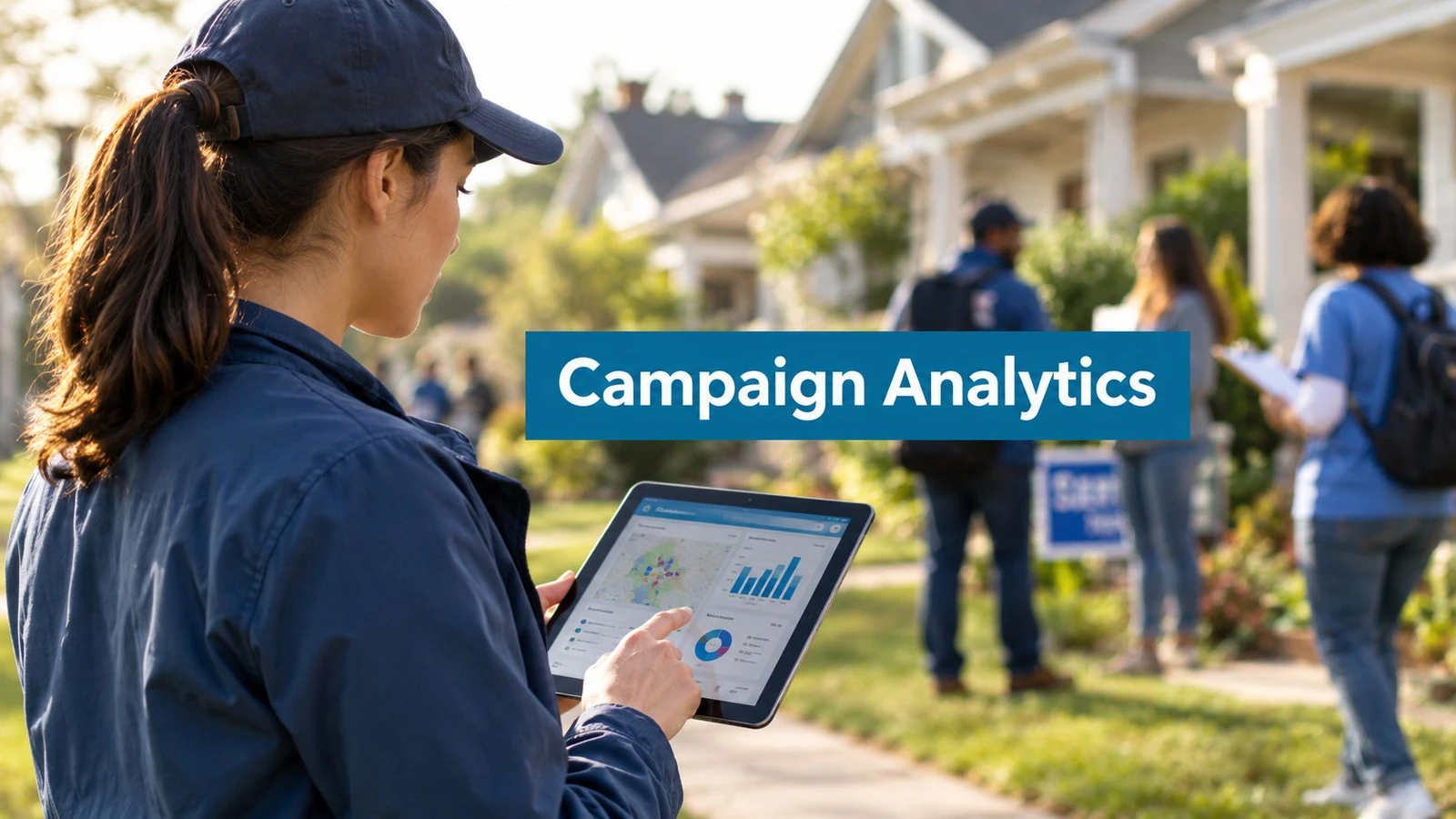
A Saturday field operation can look excellent on a dashboard while producing almost no useful voter contact. One field director sees a dense activity bar and concludes that the canvass is ahead of pace. Another notices that the same turf generated few completed conversations and flags the area for reassignment. Both interpretations can be technically correct.
The problem isn’t a lack of data. It’s that many campaign analytics dashboards combine attempted activity, completed contact, voter response, and downstream outcomes into a single performance story. That design rewards impressive screenshots instead of better decisions.
A reliable dashboard has three jobs: select metrics that change field choices, protect the integrity of the underlying data, and create a daily operating rhythm that turns information into action.
The Saturday Morning Dashboard Problem
At 8:15 on Saturday morning, the field office is quiet except for keyboards, coffee machines, and a radio update from the first canvass team. Two field directors open the same campaign analytics dashboard before volunteers arrive. The activity panel shows completed routes and a steady stream of logged attempts.
One director calls the operation successful from the total activity count. The other filters by turf and finds a weaker result. Several areas show heavy movement but few unique households reached. Another route contains repeated attempts against the same supportive voters. A third segment has delayed uploads, so its apparent underperformance may reflect synchronization rather than field execution.
Both readings fit the screen. The problem is the screen. It is combining attempted work, completed contact, voter response, and possible impact into one performance story.

Activity isn’t contact
A knocked door is an operational event. It does not establish that someone answered, that a conversation occurred, that a voter changed category, or that the interaction affected turnout. Put all of those events in one progress tile, and the field director cannot tell whether to send more canvassers, change timing, clean the walk list, or revise the voter universe.
A historical field experiment shows why the distinction matters. The New Haven study assigned approximately 30,000 registered voters to different outreach conditions before the November 1998 election. Personal canvassing increased turnout by approximately 6 percentage points, while telephone calls produced no statistically significant increase and direct mail produced only a small effect, as reported in the field experiment on canvassing, telephone calls, and direct mail.
The practical lesson is clear. Track the doors attempted, households reached, conversations completed, responses recorded, and later outcomes as separate stages. Then connect them with stable household or voter identifiers, defined response codes, timestamps, and an audit trail. Without that governance layer, a high activity count can reflect duplicates, stale assignments, or late uploads instead of real contact.
Field rule: A large activity count proves that the team moved. It does not prove that the campaign changed behavior.
Built for decisions, not screenshots
A dashboard earns its place in the field office by supporting a correction during the current shift. Totals can stay visible, but they cannot be the headline if the underlying records are incomplete or the contact stages are mixed together.
A useful campaign analytics dashboard should answer three questions quickly:
- What is happening now? Show current activity, route progress, staff location, and sync status.
- Is the contact useful? Separate conversation quality, voter category, repeat-contact patterns, and persuadable households remaining.
- Can the result be trusted? Surface data freshness, unmatched records, duplicates, suppression rules, and audit information.
Those questions connect measurement to action. Metric selection identifies the signal. Data governance establishes whether the signal is real. The daily operating rhythm determines whether a manager changes turf, retrains a team, or fixes the data before another shift repeats the same mistake.
What a Campaign Analytics Dashboard Is Really For
A campaign analytics dashboard isn’t a report placed on a screen. It’s a decision surface, a shared workspace where each role can see the information required for a specific action.
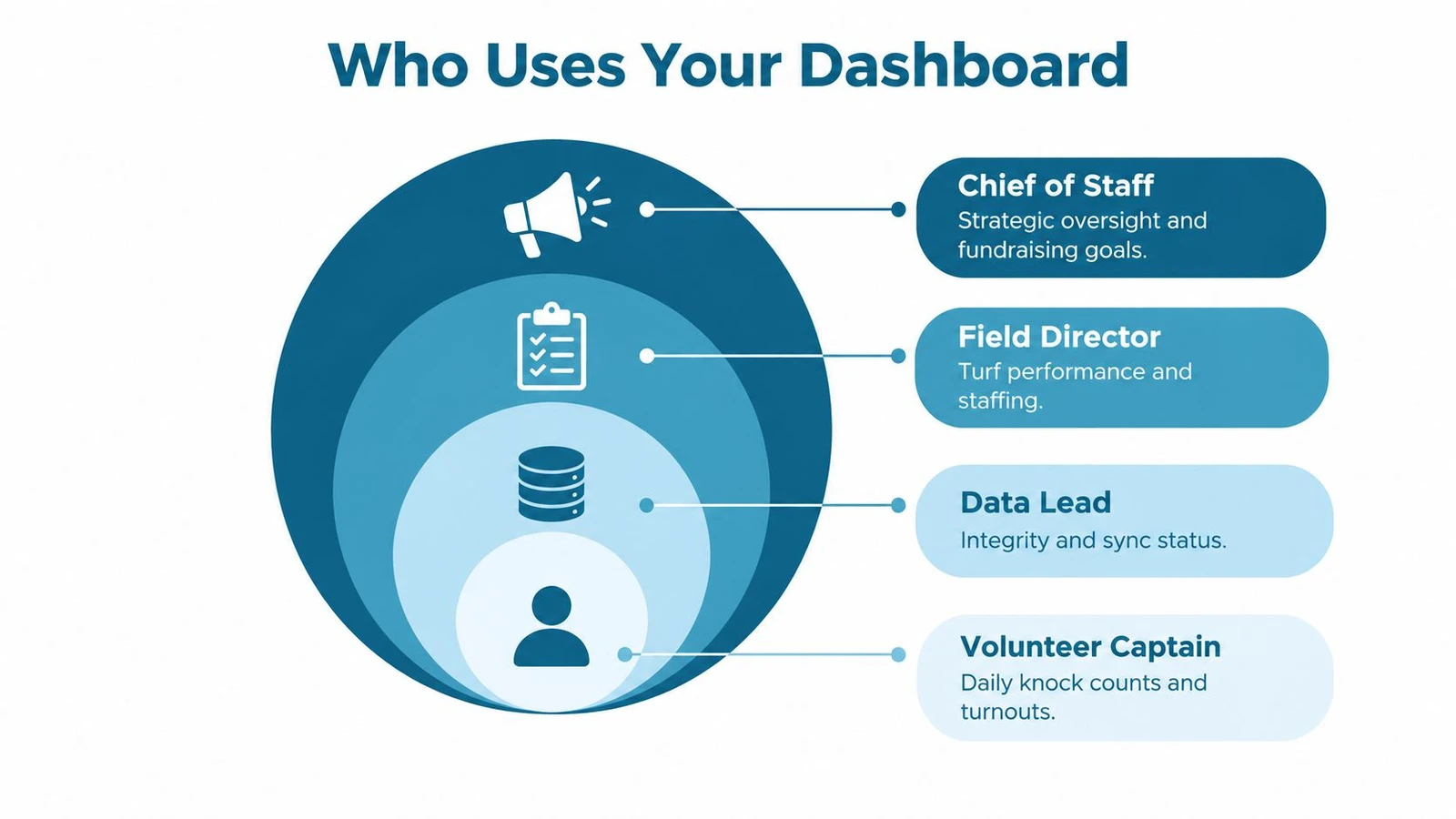
The chief of staff wants strategic oversight and a clear connection between field activity and campaign priorities. The field director needs to reassign turf, move canvassers, and retire a worn walk list. The data lead needs to locate broken joins, stale uploads, and inconsistent response codes. The volunteer captain needs a simple view of assigned routes, completed work, and unresolved follow-up.
Those users can share one data foundation without sharing one identical view.
Start with the decision
Dashboard design should begin with the action, not the chart. Each tile should answer a question such as:
- Which turf should receive another team during the current shift?
- Which route has high attempts but weak completed contact?
- Which vendor or data source is producing unmatched records?
- Which voter segment has been contacted repeatedly without a new response?
- Which mobilization outcome can be connected to a prior field interaction?
If a tile doesn’t lead to a decision before the next shift, it probably belongs in a report, not on the operating screen.
The field director’s view should make reassignment easy. A route map without completion status is decoration. A completion status without contact quality is incomplete. A contact-quality view without data freshness can mislead the manager at the exact moment a correction is needed.
Then map the data foundation
Under the interface sit several connected systems:
- The voter file supplies household and voter records, geographic information, eligibility fields, and campaign-specific segments.
- The turf system assigns records to routes and defines the boundaries that field teams will work.
- The canvassing application records attempts, timestamps, locations, response codes, notes, and offline activity.
- The matching layer connects field submissions back to voter records while identifying duplicates and unmatched contacts.
- The reporting layer aggregates events into team, turf, shift, and outcome views.
A dashboard can only be as trustworthy as the handoffs between those layers. A polished chart can’t repair a duplicate voter file, an overlapping turf boundary, or an incomplete synchronization queue.
Design for the first thirty seconds
A manager should understand the current situation within thirty seconds of opening the dashboard. That doesn’t mean every detail must appear immediately. It means the first screen should expose the exceptions that require attention.
The initial view should show live activity, contact quality, mobilization outcomes, and data warnings. Filters can handle deeper analysis by turf, team, voter category, contact date, or route. Leadership may need a summary, while the field director needs an exception list and the data lead needs an audit trail.
The strongest design principle is straightforward: one data foundation, role-specific decisions. A single crowded screen that tries to satisfy everyone usually leaves every role searching for the information that matters.
Core Metrics Every Dashboard Should Separate
A campaign analytics dashboard should not compress field performance into one blended score. Activity, contact, impact, and data reliability answer different management questions. Combining them produces attractive screenshots and weak decisions.
Four buckets, four management questions
Live activity shows what the operation is doing now. Track doors attempted, shifts in progress, route completion, active teams, and application availability. These measures help managers assign staff, reopen stalled routes, and fix operational delays. They show movement, not persuasion.
Contact quality records what happened when a field worker reached a voter. Conversation rate, supporter or persuadable classification, refusal rate, hostile response rate, and unique households contacted belong in this group. These measures show whether the team is reaching the intended audience and whether another contact may be worthwhile.
Mobilization impact links field contact to a later action. Pledged voters, returned vote-by-mail requests, early-vote commitments, event attendance, and verified turnout can sit here when the campaign can connect those outcomes to earlier treatment or contact. Keep observed outcomes separate from proven causal effects. A pledge after contact is evidence of an outcome, not proof that the contact caused it.
Data quality determines whether the other three buckets deserve confidence. Match rate, duplicate flags, dropped attempts, response-code completeness, synchronization lateness, suppression compliance, and audit history should appear beside operational metrics. Hiding them in an administrator view lets uncertain numbers pass as facts.
| Metric Bucket | Example Metrics | Decision It Should Change | Common Mistake When Blended |
|---|---|---|---|
| Live activity | Doors attempted, active shifts, route completion, app status | Reassign staff or troubleshoot a stalled route | Treating movement as persuasion |
| Contact quality | Conversation rate, unique households, voter category, refusal rate | Change turf, timing, script, or follow-up priority | Counting repeated attempts as new reach |
| Mobilization impact | Pledges, returned requests, early-vote commitments, verified turnout | Adjust voter targeting and follow-up | Claiming that activity caused an outcome |
| Data quality | Match rate, duplicate flags, sync freshness, response completeness | Repair a source, pause a workflow, or correct definitions | Presenting uncertain numbers as precise |
Separate rate from denominator
A contact rate without its denominator can hide saturation. A high rate among a small group contacted repeatedly may matter less than broader reach across unique households. Give managers comparisons for first and repeat contact, recent and older activity, assigned voters and successfully matched voters.
The historical evidence supports this discipline. Earlier field research found stronger turnout association for canvassing than for direct mail or telephone calls. That finding does not make every door equally valuable. It reinforces the need to distinguish completed contact from attempted contact and to compare downstream outcomes against an appropriate baseline.
The dashboard should preserve treatment and control definitions whenever a campaign runs an experiment. Record who was assigned to each group, which contact they received, and which outcome window applies. Doors knocked alone cannot establish effectiveness. Without those definitions, an apparent lift may reflect targeting, timing, reporting gaps, or unequal follow-up.
Field teams selecting operational fields can use this guide to canvasser performance metrics to turn broad activity reporting into a more disciplined measurement scheme. The practical test is strict: a metric belongs on the dashboard only if it can change a decision before the next shift. Metrics that only decorate a report should stay out of the headline view.
How Data Flows From the Field to Your Screen
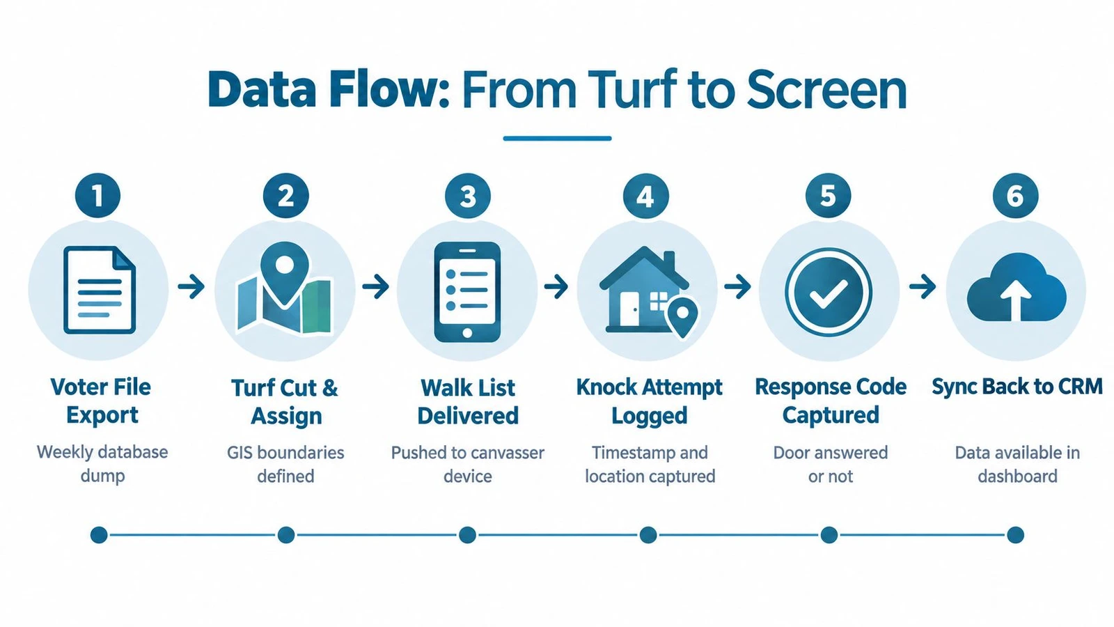
Every field number has a journey. A record starts in a voter file, moves through turf assignment, reaches a canvasser’s device, becomes an attempt or response, synchronizes back to a database, and finally appears in a dashboard tile.
Each handoff can change the count.
The pipeline in practice
The voter file export establishes the source universe. Deduplication may remove records, outdated records may remain, and suppression rules may not refresh at the same time as the rest of the file. If those definitions aren’t recorded, the dashboard can’t explain why the current universe differs from an earlier report.
The turf cut then divides that universe into routes. Overlapping boundaries can assign the same household to multiple canvassers. A route may also contain records that fall outside the intended geography because of geocoding or boundary errors.
The walk list reaches a mobile device, sometimes before the device has a reliable connection. Offline capture is useful in the field, but it creates a timing difference between the moment an attempt occurs and the moment the central database receives it.
At the door, a canvasser logs an attempt and selects a response code. Free-text notes can introduce inconsistent labels for the same outcome. One team may record “not home,” another “N/A,” and a third leave the response blank. The dashboard then treats a definition problem as a field-performance problem.
Show the uncertainty beside the activity
The dashboard should expose the pipeline instead of hiding it. A manager needs a visible timestamp for the latest synchronization from each team, a count of unmatched submissions, and a clear distinction between attempted doors and reachable or completed contacts.
Useful warning fields include:
- Sync freshness: Show the latest successful upload for every team or device.
- Match status: Separate records matched to the voter file from records awaiting review.
- Duplicate status: Flag repeated submissions and overlapping household assignments.
- Response completeness: Identify attempts with missing or invalid response codes.
- Suppression compliance: Confirm that the current suppression list has reached every active route.
- Audit history: Record who changed a definition, corrected a record, or reprocessed a file.
Independent campaign analytics guidance warns that 5–10% discrepancies can occur across systems because tracking methods and data freshness differ, as described in this campaign analytics and measurement guide. The point isn’t to accept discrepancies casually. It’s to make them visible, explainable, and assigned to an owner.
Teams that need a broader explanation of how operational records move into a reporting system can review this real estate dashboard CRM setup, which offers useful process context even though the field data itself is different. Campaign managers should also document the definitions and ownership rules in a campaign data management workflow.
Why Doors Knocked Is the Wrong Headline Number
“Doors knocked” is attractive because it is easy to count, easy to rank, and easy to display in a large tile. It also creates the wrong incentive when used as the main measure of field performance.
A canvasser can raise the count by moving quickly, revisiting familiar supporters, or working a route with poor reachability. None of those actions necessarily expands the campaign’s contact universe. A leaderboard built around attempts can reward speed while hiding the point at which another pass through the same turf stops producing new information.
The better question is not how much movement occurred. It is whether the operation is finding new households, identifying useful voter categories, and producing mobilization opportunities that the campaign can follow up.
Use saturation views
A stronger dashboard should show:
- Unique households reached: This separates expanded reach from repeated activity.
- Contacts by voter segment: This shows whether the campaign is finding persuadable or mobilizable voters rather than only confirmed supporters.
- Conversation rate by turf age: Older turf may need a new route, new timing, or retirement.
- Remaining persuadable share: This indicates whether another wave is likely to produce useful contact.
- Cost per quality conversation: This is more informative than cost per attempt when staffing decisions are under pressure.
- Repeat-contact distribution: This reveals whether field teams are concentrating on a narrow group.
A practical comparison makes the problem clear without relying on a single leaderboard. Team A can lead on attempted activity while returning to the same supportive households. Team B can record fewer attempts while reaching more unique voters and identifying more supporters who need follow-up. The first team wins the screenshot. The second team may be doing the work that changes the campaign’s next decision.
| Metric | Team A, Leaderboard Winner | Team B, Lower Count, Higher Impact |
|---|---|---|
| Attempt volume | Higher | Lower |
| Unique household reach | Narrower because of repeat contact | Broader across the assigned turf |
| Conversation quality | Mixed or unclear | More clearly tied to voter categories |
| Supporter identification | May reflect familiar voters | Produces new follow-up opportunities |
| Recommended action | Check saturation before sending another wave | Expand or prioritize the productive segment |
Measure incremental effect
The United Kingdom field experiment with the Liberal Democrats illustrates why contact rates and incremental effects belong in the same dashboard. Party leaflets increased turnout by 4.3 percentage points, while adding a canvass visit raised turnout to approximately 4.9 percentage points above the untreated comparison group, a marginal canvassing contribution of about 0.6 percentage points beyond the leaflet. The successful canvass contact rate was only 28%, as documented in the United Kingdom get-out-the-vote field experiment.
Those findings don’t make a low contact rate automatically bad. They show why assignment, completed contact, voter behavior, and baseline comparison must remain distinct. A campaign should ask whether a new wave reached people who had not already been contacted, whether the intervention added anything beyond existing outreach, and whether the comparison group supports a causal interpretation.
Building a Practical Dashboard Layout
A single operating screen can balance the four metric buckets if each area has a defined job. The layout should make exceptions visible without forcing the field director to open several reports.
Use four working quadrants
Top left, live activity. Display attempts during the current operating period, active shifts, route completion, team assignment, and synchronization freshness. The most useful interaction is a drill-down from a stalled team to the affected route and device.
Top right, contact quality. Show conversation rate, unique households reached, supporter classification, persuadable share, and refusal patterns. Break the view out by turf age so that repeated activity doesn’t appear equivalent to fresh contact.
Bottom left, mobilization impact. Connect contacted supporters to later actions such as pledges, returned vote-by-mail requests, early-vote commitments, or verified turnout. Include the original route, canvasser, contact date, and voter category so staff can identify follow-up responsibility.
Bottom right, data quality. Show matching status, duplicate flags, suppression compliance, response-code completeness, sync errors, and recent changes to metric definitions. This block should never be hidden behind an administrator menu.
Give every tile a decision rule
A designer can reproduce the layout in a reporting tool or spreadsheet if every field has a clear definition. The following wireframe is a practical starting point:
- Current activity: Compare recent attempts with the campaign’s pace plan. Flag teams that stop sending events or routes that remain incomplete.
- Contact quality: Compare unique contact with repeat contact. Flag turfs where contact quality declines across successive waves.
- Mobilization: Show counts by voter category and contact owner. Flag outcomes that lack a matched prior contact.
- Data quality: Display the latest sync, match status, duplicate status, and response completeness. Flag any metric whose definition or source changed recently.
Suggested thresholds should be set from the campaign’s baseline, not copied from another operation. A route may be healthy when its completion is high and its data is fresh, while the same completion level may be misleading if many records remain unmatched. The dashboard should therefore use labels such as on pace, review, and blocked, with each label tied to a documented rule.
Automation can reduce manual assembly, but it shouldn’t erase provenance. Teams evaluating dashboard automation can use this guide to automated business intelligence for general workflow ideas, then adapt the underlying principles to voter data, privacy controls, and field accountability.
The layout should also support filters for turf, team, voter category, route age, contact date, and data source. A manager should be able to move from an exception tile to the records behind it without exporting a separate file.
Making the Dashboard a Daily Operating Habit
A campaign analytics dashboard becomes useful when the team treats it as part of field management, not as a report assembled after the shift. The field director should open the screen before assignments are finalized and ask what changed since the last operating period.
The daily huddle should answer three questions:
- Which contacts produced the strongest persuasion or mobilization signals?
- Which turf assignments are underperforming against their expected yield?
- Which data-quality warnings appeared during the previous operating period?
Each major metric needs an owner. The field director owns turf and staffing decisions. The data lead owns matching, definitions, synchronization, and audit issues. The volunteer captain owns assignment completion and response-code discipline. Leadership owns the connection between field outcomes and campaign priorities.
Manage pace before totals
End-of-day totals arrive too late to fix a weak route. Midday checks should compare current pace with the campaign’s operating plan, then trigger a concrete response. A low activity pace may require reassignment. A high activity pace with weak unique contact may require a turf change. A sudden decline in completed conversations may require a script, timing, or data review.
The daily memo should record the two changes the team will test during the next operating period. It should also state which result would justify keeping the change and which result would require another correction. That practice turns the dashboard into a management record rather than a passive archive.
A field team can use this pre-shift checklist:
- Data sync: Confirm that active teams and devices have uploaded recent records.
- Device assignment: Verify that each canvasser has the intended route and current walk list.
- Turf status: Check for overlap, stale assignments, suppression updates, and unresolved duplicates.
- Metric baseline: Review the campaign’s current activity, contact, mobilization, and quality definitions.
- Ownership: Assign a named person to every warning that needs correction.
- Decision triggers: Confirm what action follows a stalled route, weak contact quality, or unreliable data.
Live field reporting is most valuable when it supports that operating rhythm rather than encouraging constant screen watching. Campaign teams exploring the relationship between live data and same-day decisions can consult this guide to real-time canvassing analytics.
A campaign analytics dashboard should leave managers with fewer unanswered questions, not more attractive charts. Teams that need route planning, offline field capture, automatic synchronization, voter matching, and live campaign reporting can visit doornoc to see how its canvassing platform connects field activity with operational oversight. The next step is to define the campaign’s metric owners and data rules before the next shift, then configure the dashboard around decisions rather than totals.
Looking for a tool to run this? doornoc’s canvassing software bundles voter data, automatic turf cutting, the mobile app, and live reporting in one platform.